Idea Development
Design
So, this is my idea development and i do not have it much. First in my sketch, I like to put the cloth of the dancer and those "mayang" in my design. The cloth i want to represent the smooth of the dance itself but i cant think of it and i came out with that sketch. I did not decide the color yet of this design. For the second of my sketch, I make half and half to balance my design same as Christina Mcphee artwork. I tried to make balance and I came out with some grids to get it balance. I want to put the cloth of the dancer and the face of those seven princess, but the design will look really compact and I need to simplified it.
Art
My idea development in my art is very simple and i can not get many sketches. So, for the first sketch, i want to create an art with using those seven princess cloth that not arranged on the paper. I put those seven princess cloth because i do not want all my viewers know directly that is the "Ulek Mayang" dance. I still using smooth concept in this artwork because i want to sustain the beautiful of this traditional dancing style. For the second artwork, I decided to choose those seven princess as my major thing in my artwork. So i put all six faces of those princess and one face of the oldest princess but for the oldest princess, i put at between of those six princess. Those all princess faces are really need to be balance to make my artwork look like 50% and 50% balanced. I had choose creepy background and some texture of vector to look more creepy but i still sustain the beautiful of this dance.
Process
Design
Step 1
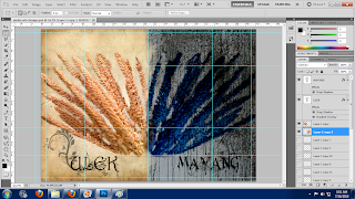
I had pick a vintage background and look like a long time ago paper and I decided to put "Mayang" as my major design thing. So, I make a double-photo montage that just like Christina Mcphee style.
Step 2
My concept is all about the good and bad site of this dance and I make it more creepy of the other site of Mayang which is i change the color into dark blue and a little bit of black. Besides, I also put some of smooth vector that represent the beautiful of this dance.
Step 3
For the font, I make it sure the good site is more like fancy and beautiful font and for the bad site I pick a scary and more creepy font.
Art
Step 1
My artwork is all about heaven and those seven princess. So I picked a sky with many clouds to represent heaven with a double-photo montage style.
Step 2
Creepy is my concept and I try to apply in this artwork. So I had changed the sky into creepy background which is more gray, brown and black colors. I also put those six princess which is three at the right and three at the left with equally balanced.
Step 3
For the third step I had added some of swirl and smooth vectors to represent the beautiful of the dance and I make sure those vectors are in low capacity because I do not want it to be more darker than the background.


No comments:
Post a Comment